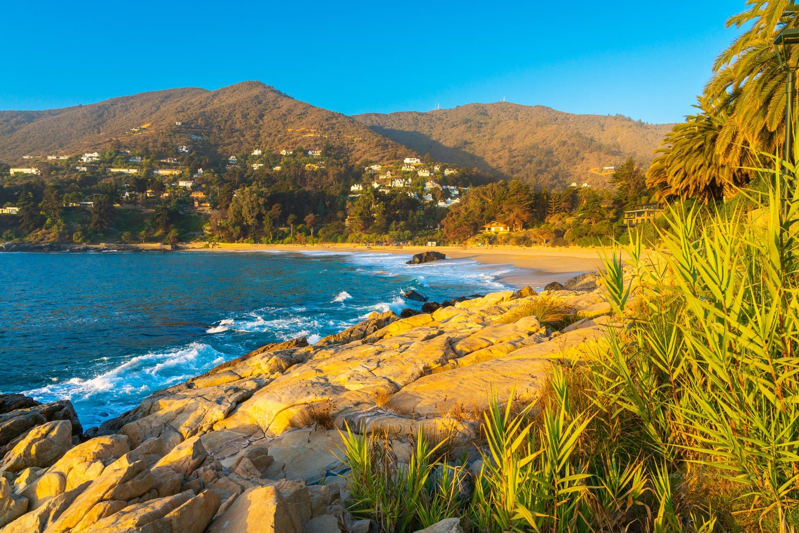
Those following my work for a while know that my images are vibrant and colorful. But I’ve been struggling with some shots. No matter how much I cranked up Lightroom’s vibrancy (or saturation), it didn’t seem right. I’m sure that some of you have been there as well.
I’ve developed a solution that makes eye-pleasing color adjustments that are just right (for me). I’ve been playing around with various settings, and now I will share my favorite settings and potential pet peeves to be aware of when using the kind of adjustment.
The “secret” panel is Calibration. You’ll find it at the bottom of the Lightroom Classic Develop module.
You have sliders for Hue and Saturation for all three channels Red, Green, and Blue. And a Shadows slider (that I haven’t been using).
Most of the weight lies in the Blue channel Saturation slider. Pull it from zero to 60 or even 100, and watch the difference.


Increasing the saturation in the blue channel makes images more vibrant overall. It’s the kind of vibrancy that I find difficult to replicate using the other sliders. And I do like the results!
I started using this on practically all my images and built it into my adjustment template I use for all images on import.
My optimal settings for Lightroom calibration

I have been experimenting with adjusting saturation for the red and green channels, and here are my go-to calibration settings that I use now:
- Red: saturation +5
- Green: saturation +15
- Blue: saturation +60
Feel free to experiment with your images and adjust accordingly. Feel free to try even 100 on the blue channel; maxing this out is okay.
Pet peeve to using calibration
After uploading your images to certain websites, they may show color banding – the transitions between various shades of a single color are not gradual. It happens because some websites (usually those that sell images) try to make the photos more attractive and slightly enhance them for prospective buyers. The technique they use is – yes, you guessed correctly – increasing the blue channel saturation.
The solution is simple. Tune down on the blue channel saturation when you export images for a site where you experience this behavior, and they will show OK. About +30 is usually fine. However, this step won’t be necessary for 95 % of the websites you use.
Over to you
Let me know if you have been using this before. If you have, what are your favorite settings? If not, what are your first impressions after having tried it for the first time?
